Recently, I found myself without a studio space where I could use oil paints…and this lasted for a period of time; long enough for me to have to consider how to stay involved and continue working on basic skills which need continuous practice to maintain & to evolve. Since my ‘regular job’…I emphasize this because as a web designer, I am fortunate to be able to be working in a different medium; one which involves working on digitally designing websites on a computer. It seemed natural for me to find a way to utilize it for practicing and developing techniques that would be beneficial for both web design and oil painting.
I usually use GIMP, (GNU image Manipulation Program); for creating and editing design elements for web design (i.e. full-page designs, banners, logos, and image editing & enhancement), however; one day when I wasn’t working I decided to try working with Microsoft ‘Paint’ to work with colors.
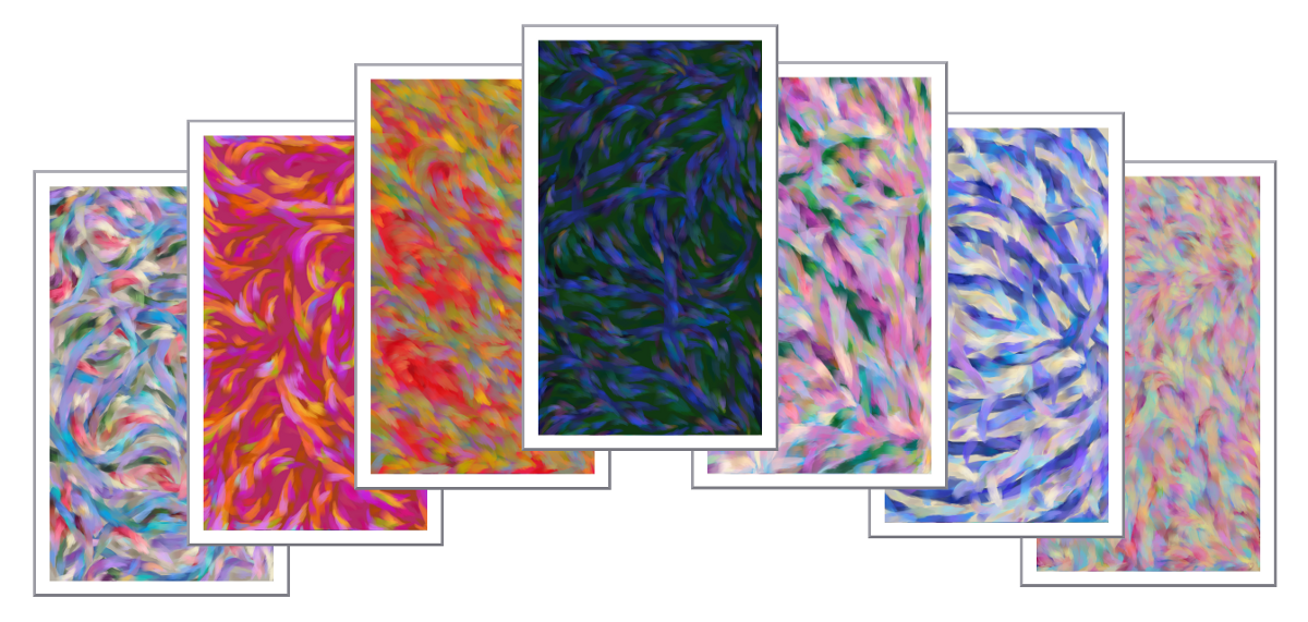
View a Gallery of Color Studies Using Microsoft PAINT By Clicking on the Image Below
[EasyGallery key=’4′]
The 1st thing I did was to choose a background color…this would determine what color ‘palette I would be working with. I then selected a fairly dark color for the ‘complement’ color to the background, (which can be determined by looking on a ‘color-wheel’). I intentionally choose one or more darker colors so that the other colors I will be adding will have what amounts to an ‘under-painting’. An under-painting is used to give a painting depth and contrast, and many oil painters will do an entire painting using just one color; varying the amount of darkness & lightness, thus producing the shadows, highlights and forms.
I then choose the type of brush I want to use from the choices in the top ‘menu’, which is usually the largest; and that also gives me the loosest brush stroke.
Once I have placed the darkest colors, I begin to add more colors on top of them. I usually place lighter, (but not the lightest of a particular color..I work up to that); in many areas of the ‘canvas’, so as not to be too repetitive and make the painting appear dull. Then it’s a matter of choosing the ‘correct’ colors that will go with those I have previously applied. The are many different colors that can be added to complement them, and at this point I make sure that the next colors I choose will enhance each of the ones adjacent to them. It sounds more complicated as I write this than it really is…to a large extent it’s just a matter of using your instincts, and many times as you’re finished adding one color, you are inspired as to which color should go next to it. Often times once I’m done with a color that a certain area ‘needed’ I will step back a bit and see where else it belongs. I work the background, by using slightly lighter & darker shades of the color I used originally, and gradually add some highlights and shadows where they are needed. Once I’ve exhausted using them on all the areas possible, I add very subtle accent colors here and there to help blend the edges of the complementary colors I used in the beginning. One important thing to note, as you’re adding different colors…make sure to use the brush in different directions as needed. Many times I’ll place several colors in one direction following the shapes of the ‘lines’ I ‘painted’ with the brush, other times I concentrate on finding colors to help break the edges to give it a more cohesive appearance.
Other exercises that painters may choose to work on color, include: creating color charts by placing colors across & down in rows similar to a checkerboard and then paint a circle or square of each from darkest to lightest and gradually add or decrease the intensity by adding a varying amount white. You can also add varying amounts of black to make a color gradually darker. You continue this process by adding the colors going across and again.